Into the Design of PayMaya's Rebrand to Maya
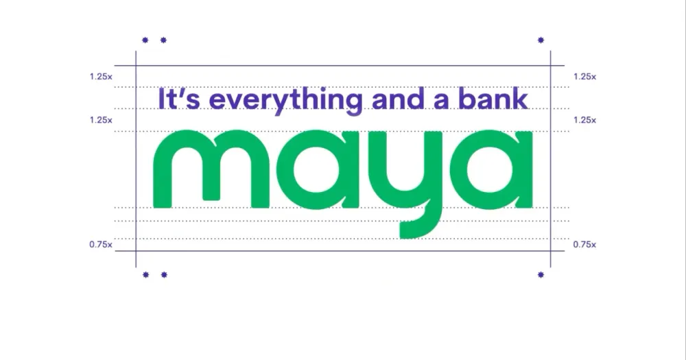
It's everything and a rebrand.
With PayMaya’s recent pivot from simply being a digital wallet competing with GCash into adding features like a digital bank as well as a cryptocurrency exchange, the old branding didn’t seem like it was up to the task to handle its own road to becoming an increasingly comprehensive and competitive fintech app. Thus, it seemed like a rebrand was sorely needed. We take a look into the design and history of PayMaya’s rebrand to Maya.
It’s not “PayMaya” anymore, it’s “Maya”
First comes the name. In a move that took years before someone had to approach them with this good idea, PayMaya’s name has been changed to “Maya”. This change alone should be an improvement toward brand recognizability. In the very battle of day-to-day pronunciation, the name switch puts them at par with other two-syllable names like “GCash”, “GrabPay”, “Venmo”, “Cash App”, and “PayPal”, among others. But dropping the very word “Pay” shows that the company and the brand want to truly push it beyond payment and into more ways of interacting with money.
We already knew that the separate word “Maya” could be used as the general rebrand for PayMaya a while back when we first heard the news about Maya Bank, Maya’s BSP-authorized digital bank that would eventually become part of Maya’s shift to offering more services.
It’s certainly a far cry from their original failed branding before PayMaya, “MePay”, but we’ll talk about that later.
Bring in the hydra!
Next comes the identity. To handle this gargantuan task, you may need to call up something that can handle “gargantuan”.
A hydra.
Plus63 Design Co. and The Acid House, both heads of the renowned local creative supergroup Hydra Design Group are the ones handling Maya’s new brand identity and promotional material. To split the rebrand’s tasks, Plus63 Design Co. handles the general brand identity and typography while The Acid House focuses on 3D illustration, motion graphics, CG animation, and VFX.
According to a post from The Acid House, the rebrand had already been a work-in-progress since the start of 2022.
Vivid colors and pecking, just like a maya
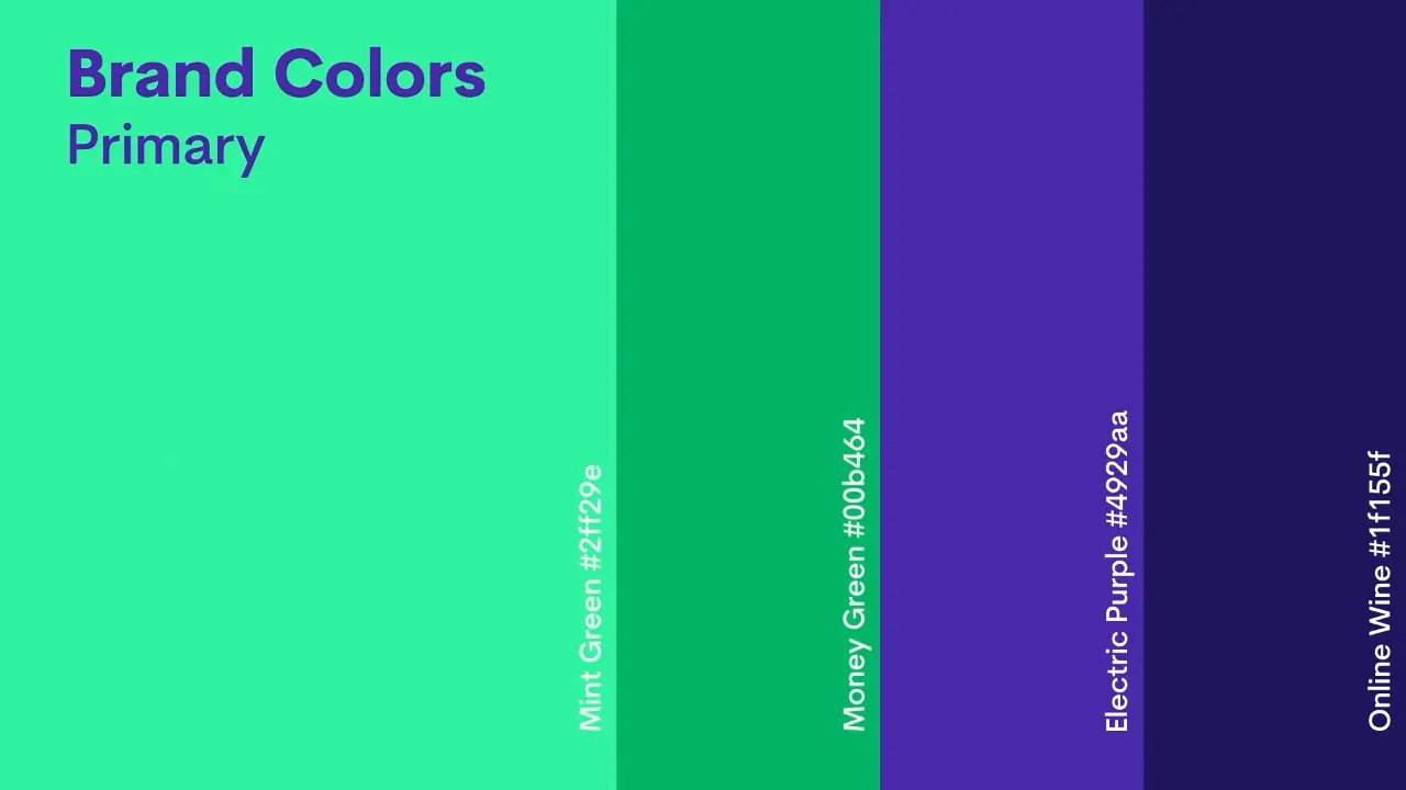
Moving away from its secondary color of blue, Maya transitions its second color to purple, with the new colors becoming more vivid and bright. The interface of the app is also leaning toward a darker shade while its business-to-customer presentation (Maya QR) leans more toward a purple-green gradient compared to its darker tone or pure green color in its PayMaya days.
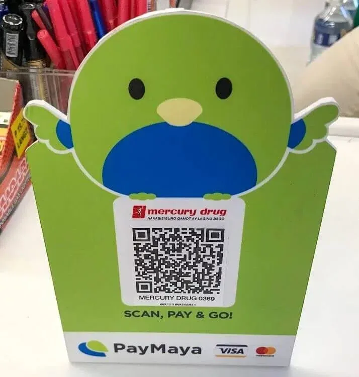
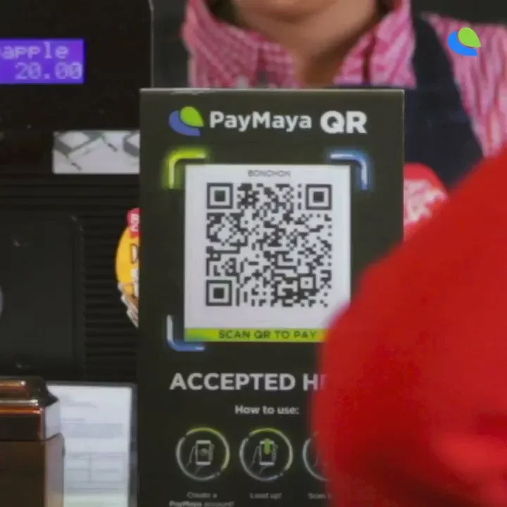
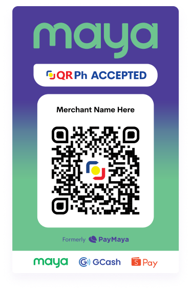
From left to right: PayMaya QR code template with the bird, PayMaya QR code template but dark mode, Maya’s new QR code template
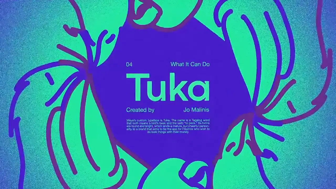
Type is important for a lot of businesses too. They help brands express more of their personalities, set a mood and control their narratives. Such was the case for Tuka, a custom typeface I developed for the rebrand of digital banking app PayMaya, together with design studio Plus63. […] Because of these unique and easily recognizable features, Tuka can represent Maya’s brand identity even in the absence of the brand’s logo.
Jo Malinis, creator of “Tuka” typeface
Quoted from “Discovering the Character of the Philippine Type”, a talk by Jo Malinis at CREATEPhilippines Creative Futures 2022
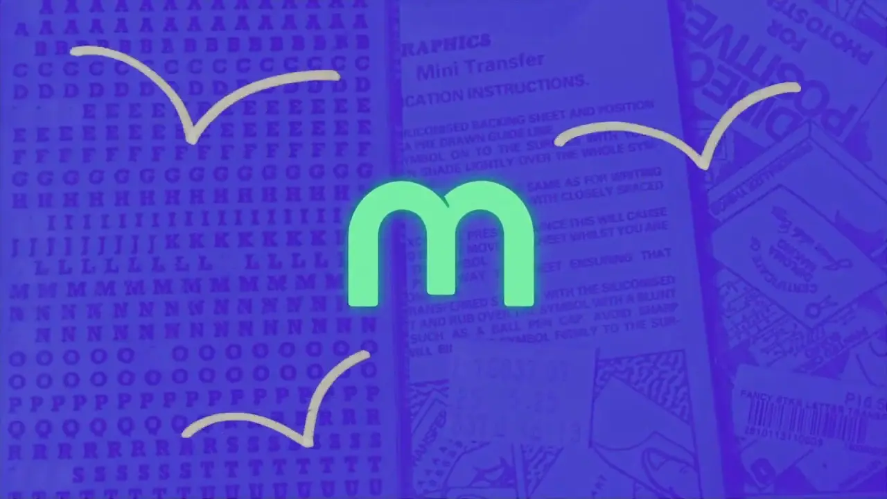
The main custom typography for the Maya rebrand is the Tuka typeface, created by type designer Jo Malinis as her last project under Plus63 Design Co., in collaboration with Apol Sta. Maria and Miguel De Dios. The new typeface aims to be sleek but cheerful and includes certain references to Maya’s previous identity PayMaya, where the logo with the maya bird’s wings and its cartoon bird mascot were mainstays in its former identity. One of the references being the typeface’s main feature, the notches or “ink traps in the shape of a bird’s beak” which gives Tuka its identity and uniqueness against other similar typefaces. The main “m” in Maya is also modeled after a monoline rendition of a maya bird.
Images from “Discovering the Character of the Philippine Type”, a talk by Jo Malinis at CREATEPhilippines Creative Futures 2022
To supplement Tuka, the new branding also uses the typeface Cerebri Sans Pro from type foundry Hanken Design Co. as a secondary, which is used in any areas that need more text and where Tuka wouldn’t be appropriate to use given its importance as a logo font; Tuka is mainly and intentionally used in headlines, sub-headlines, and short text.
Money in motion, and the third dimension
The visuals of The Acid House are brought in for the Maya redesign to cover motion branding, iconography, and more. It can be said that their previous projects tend to be 3D-heavy, and we see that shine in Maya’s branding; its identity as an accelerator of fintech is proudly shown in its motion design inspired by physical cash, and its iconography aims to be expansive in expression similar to the expansiveness of Maya’s new and old offerings, even going as far as to experiment with new textures and materials for its 3D design. This is a pivot from PayMaya’s branding that aimed to be more 2D-heavy, specifically with its cartoon bird mascot. These 3D designs also get used as hero images to showcase Maya and its products.
But what about the actual app?
As part of the rebrand, the Maya app is also getting a fresh coat of paint. Or, well, at least as much of the front-facing stuff. If you take a look deeper into the app, you’ll still find a lot of legacy design from PayMaya that hasn’t been updated yet. Granted, it seems to be difficult for a lot of fintech apps—including Maya’s rival GCash—to do a full refresh on every part of their app. Maya has mentioned to other places and in their marketing material that the app will soon have a dark mode, but it still can’t be found at the moment. The new design looks to be more readable and cleaned up compared to the old design, but also allows for flexibility of core services using the top row while putting importance on quick actions like QR code scanning. Maya also puts heavy importance into rounded corners as part of its branding and UI framework, which can be seen on the Maya app and its website.
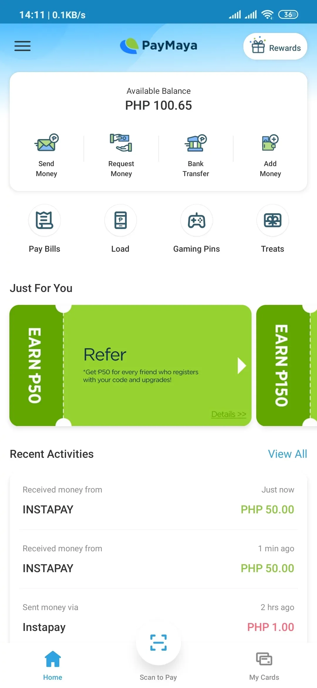
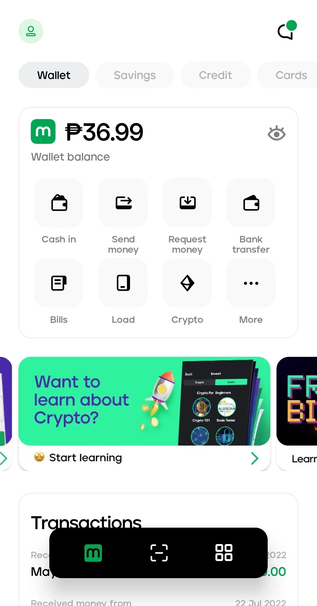
From left to right: PayMaya’s old app UI, Maya’s new app UI
This isn’t the first time Maya changed its name.
Contrary to Maya’s main rival GCash where its name has remained mainly the same since 2004, Maya has had a long history and evolution from what it used to be. Like its rival, Maya started its fintech career through a telco when Smart Communications, Inc. launched Smart Money in 2000 as a cooperation with First e-Bank (before it became acquired by BDO Unibank) to launch a card that was linked to a Smart mobile phone. From there, Smart’s fintech journey evolved into Smart Padala in 2004, an international and domestic cash remittance service that heavily relied upon mobile phones for transactions.
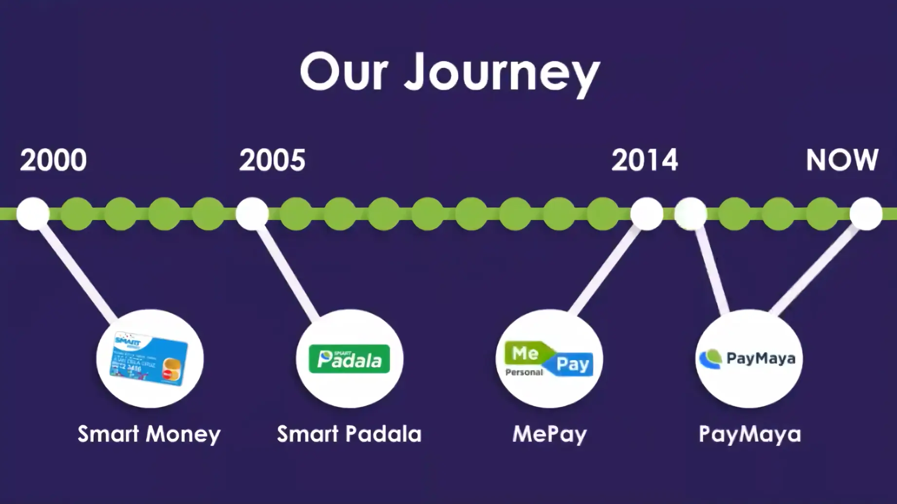
But to get to the modern incarnation of Smart’s voyage into fintech and Maya, we have to talk about MePay. Launched around a decade later as part of Smart’s internal tech startup accelerator Voyager Innovations, MePay was built in 2014 as a way to build on the success of Smart Money and Smart Padala, further solve the problem of unbanked Filipinos, and introduce fintech into smartphones. With Voyager’s help, MePay launched with a million pesos in capital and 100 days to execute… and it flopped.
As admitted by the team, the initial name and branding had their issues. Only 400 people used MePay and felt ahead of the time. But the team behind MePay learned a lot from this and took user input as it rebranded and fully launched in 2014 as its now famous name, PayMaya.
…the brand name was also not desired, kasi pag sinabi— Nung ni-launch namin ‘yun, lahit ng press sabi, “Ano yan, MePay? (pronounced meh-pie) Bakit kayo nagla-launch ng meh-pie?” *laughs* So, it became a running joke that MePay was dead before it arrived. But I think that gave us the confidence because we didn’t look at—you know—the failure, we looked at the 400 people that actually signed up and we took a look at why they signed up and all of those things…
Raymund Villanueva, former Head of Business for QR Ecosystems at PayMaya (now Maya)
Quoted from the talk “History of PayMaya with Raymund Villanueva” at UX&Chill 2020
The name “PayMaya” came from its first design and name study; lead designer Elora Que created the initial concept for the logo, which are the wings of the maya bird. The color green stood for money, while blue stood for security. The maya bird was also chosen for its name and identity because “it is one of the few things that can be found in every single island in the Philippines”, which lines up with PayMaya’s mission of financially connecting Filipinos.
Will Maya’s new branding take flight?
As Maya’s branding evolves over time, we should expect to see some sort of change in how Maya would be viewed by businesses and customers alike, either for better or for worse. Hard to tell what customer reaction to the rebrand is as they seem to talk more about PayMaya’s faults in its product rather than its brand. (That may include me too!) There’s also the big question of whether or not people will accept the new name “Maya” when people were already used to “PayMaya”. Will there come a time where Maya can confidently drop the additional disclaimer “Formerly PayMaya”? Its rival is also not sitting idly and resting on its laurels as it prepares for its own brand and design shifts.
What can be said however is that a lot of talented people are behind this rebrand, and the history of Maya goes way back. Here’s to hoping that with PayMaya’s rebrand to Maya, a lot more possibilities could be opened up beyond what they have just recently introduced, if they are to stand with their claim that it is “everything and a bank”.