GCash New App Design Being Tested, with Mixed Reviews
A new home screen design that doesn't seem to go well with some users.
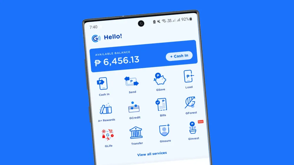
Users are receiving an updated home screen on their GCash app, with new colors, typeface, and branding.
Over the past couple of weeks, GCash has been testing a new home screen design with what looks to be a new brand refresh, focusing more on the round form of their current logo and applying it to the rest of the iconography and typography.
The home screen uses Gotham Rounded as its new typeface, with noticeably brighter shades of blue, a reorganized top area, and a much more defined bottom row.
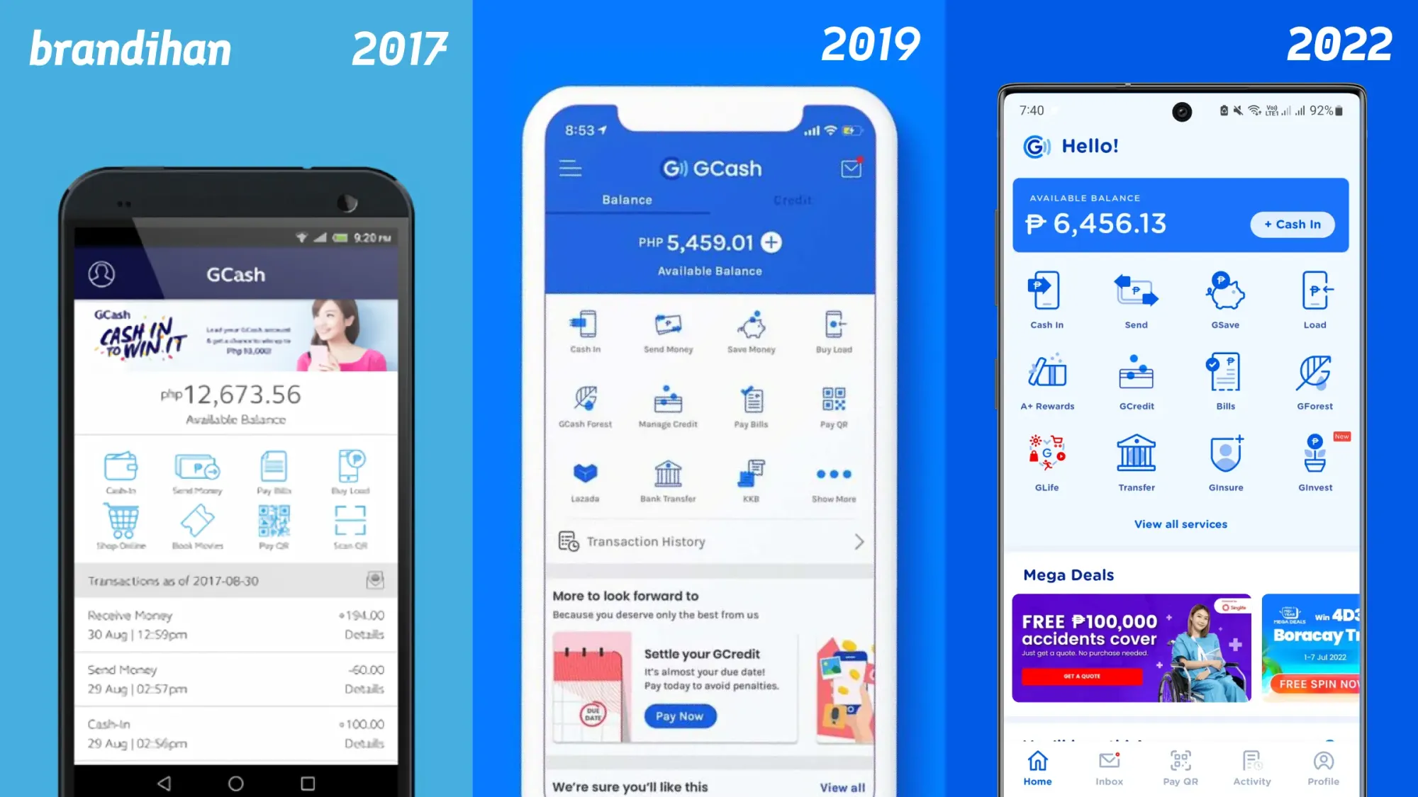
This is GCash’s third app design from the first design in 2017 that followed Globe Telecom’s old brand guidelines and the 2019 GCash-specific brand refresh from Serious Studio.
Why The New GCash App Design?
The recent app design refresh takes cues from the most recognizable part of the GCash identity: the “G” icon in the logo. The new design feels larger and rounder—more friendly, and more accessible.
For example, with the change of the numerical font from Poppins to Gotham Rounded, the numerical value of, let’s say your current balance, is much more readable from a quick glance, especially when payment in-person is concerned. It seems to be an evolution to take it further away from the pre-2019 GCash app design.
While the more rounded design takes away and reduces the “professionalism” that was sought after in the 2019 brand refresh, it allows GCash to reach a broader base of the Filipino public and everyday person and double down on its admittedly leading market position amongst other e-wallets as well as its ubiquity in modern Filipino life. In such a way, it looks less like a banking app and more like a lifestyle tool.
Weird timing and an awkward reception
There is a sort of weird timing as well that this comes on the heels of its biggest rival PayMaya’s recent complete rebrand into Maya, aiming to be as widespread in usage as GCash by re-tooling the front page of the app also.
The public reception towards the new design has been mixed for the most part on social media. While some may praise the focus on accessibility, others were dissatisfied with the change of mood and layout, and most are really just confused.
This is to be expected with brand redesigns, and effectiveness should be measured on how much it helps in the long-term rather than the short-term, alongside user research.
What was wrong with the old design? 🥲 pic.twitter.com/YYCHFurZ8j
— r.c—m (@rachelmutia) July 6, 2022
di ko talaga trip yung update ng gcash 🥹 pic.twitter.com/nbfk5heCyK
— Tofuism (@kimthetofu) July 6, 2022
Ayo the new gcash ui kinda sucks the old one is better
— Beidou simp (@disIsAlas) July 7, 2022
Gcash Old UI > New UI 😐
— Ja (@jafelipee) July 7, 2022
Sorry na hater talaga ako ng new gcash ui
— isabella marie (@sabmiglight) July 7, 2022
Para siyang design sa mga laruan ng bata https://t.co/8ETDYB137q
Trying hard maya nga yung gcash UI. Pati font at layout que horror https://t.co/rTAtthDRHW
— Rosé (@miyyloops) July 7, 2022
ngayon ko na lang binuksan gcash ko kasi nagtransfer nanay ko ng pera tapos gagi bakit ganito na ui ng gcash 😭 pic.twitter.com/Ju6ks6QLI6
— ً (@handulsettt) July 8, 2022
What's the deal with people hating on the new gcash UI? Bigger icons = more accesible for one. Style more consistent overall. Containers more apparent and defined. Accessibility is a staple of good UX guys.
— Jake Ruiz (@jakeruizzz) July 7, 2022
1. Icons looks more simpler and cleaner, there were no distracting elements (i.e., old version where two elements were overlaying e/o with the top element has reduced opacity).
— kai 🍁 MANIFESTING LUOCHA & KAFKA (@kailkailkitan) July 7, 2022
2. They put more emphasis in their services by making giving it more white space, larger icons — https://t.co/v557DCRl6H
tldr; the new user interface design makes it easier for a wider range of users that gcash has. they were also able to retain a majority of their user experience familiarization for older users to not feel confused when using the new UI. overall, it was quite nice and modern.
— kai 🍁 MANIFESTING LUOCHA & KAFKA (@kailkailkitan) July 7, 2022
The rest of the app still uses the same branding from the 2019 brand refresh created by Serious Studio. It is not determined whether there will be a full rebranding of the app or the entirety of the GCash brand—and if so—when it will be.
You may be able to check out the new home page design for yourself by updating GCash to v5.54.0:685 or later. It is available now on both iOS and Android.