SM Logo Refreshed and Rolled Out Online and On-site
The SM Group has unveiled a new logo that is now rolling out across SM's malls, services, and subsidiaries.
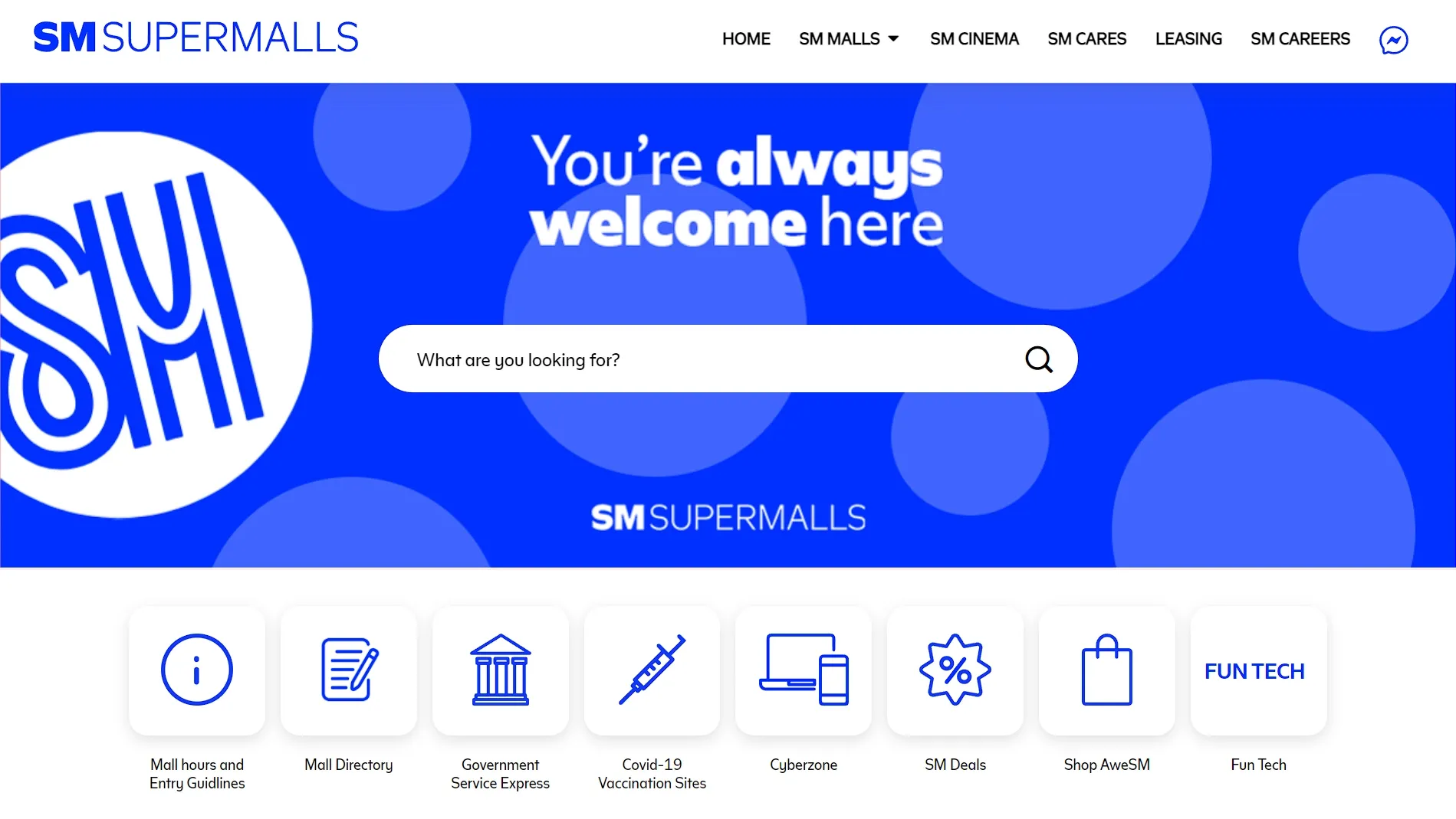
The SM group has rolled out its refreshed logo, which is now shown at all SM Supermalls nationwide. The change reflects the retail giant’s evolution as a brand and as a team. We have seen two color variations at the moment, using a brighter shade of blue compared to previous SM logos.
Aside from this, SM has developed a bespoke font called Henry Sans, named after its founder, Henry Sy, Sr. (1924-2019)
We've got fresh new looks, trendy new spots, and exciting new adventures to give you the levelled up aweSM malling experience that you deserve, and where you can create and share more aweSM moments. 💙
— SM Supermalls (@smsupermalls) July 1, 2022
Because #YoureAlwaysWelcomeHere at SM. 🤗#EverythingsHereAtSM pic.twitter.com/wDfK5R5Hlg
The refreshed brand was first presented in SM Investments Corporation’s 2021 Integrated Report (PDF):
Blue remains our unifying color, adventuring to different hues that speak closer to our business partners and our customers. […] While protecting our heritage, the refreshed SM logo brings renewed energy to our brand, evolving it as it takes its place among the best brands in the world.
— SM Investments Corporation 2021 Integrated Report, p.76
The new logo was rolled out on all of SM Supermalls’ social media pages last July 1. Prior to this, hints of the change already appeared. The recent Jujutsu Kaisen fan screening reflects the new logo for SM Cinema using Henry Sans.
The logo for SM Development Corporation (SMDC) also changes from its previous red sans-serif text on a yellow background to white Henry Sans text on SM blue background.
📣 HAPPENING NOW! The long wait is over. The highest grossing anime Jujutsu Kaisen 0 is finally here!! See the FIRST exclusive Fans screening in the Philippines atSM Cinema Megamall IMAX!❗️
— SM Cinema (@SM_Cinema) June 18, 2022
Get tickets now: https://t.co/Igbwn5T6vI#JujutsuKaisen0AtSMCinema #JJK0Movie #SMCinema pic.twitter.com/9xGEPJxn7Y
In today's #TheGoodStories, we feature one of our Trees residents. Listen to her story on how the SMDC community paved her way to become an entrepreneur, and a volunteer! pic.twitter.com/KSPMaGFFPH
— SMDC (@TheOfficialSMDC) February 4, 2022
SM Logo History at a Glance
Since its inception as a shoe store in 1958, SM has undergone several brand changes: from ShoeMart, to SM ShoeMart, to just SM. A common feature among all logos is the blue color and the signature outlined stripes. In its latest iteration, the SM logo has more distance among each element.
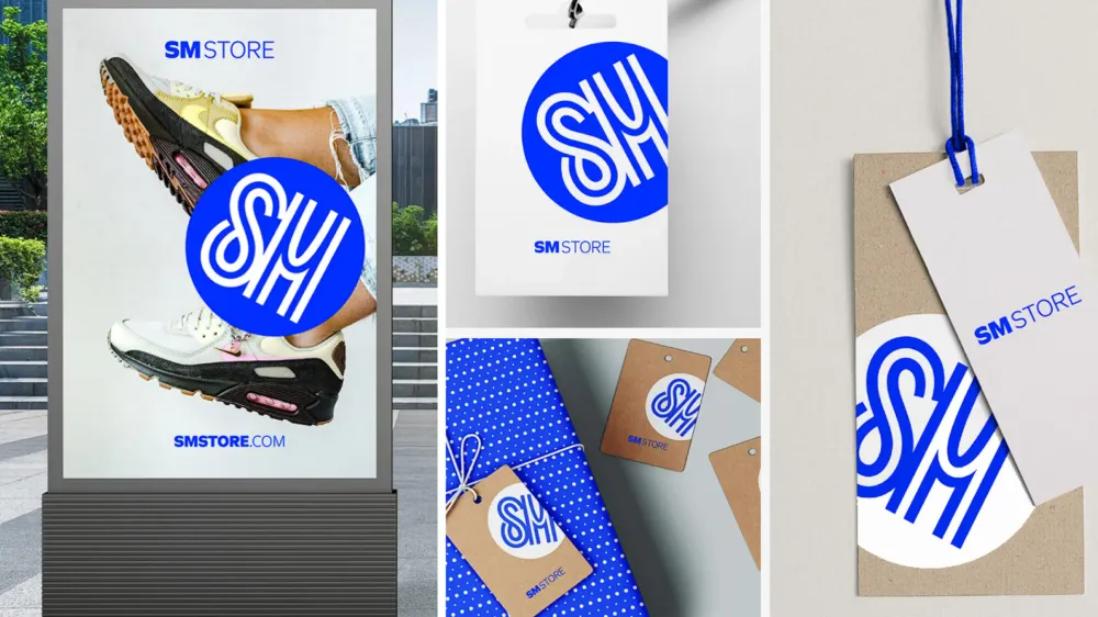
New Logo Applied Online and On-Site
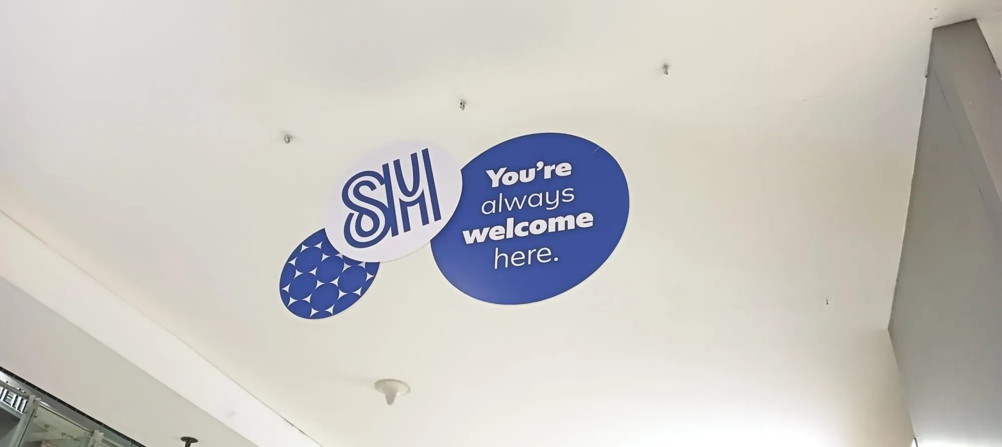
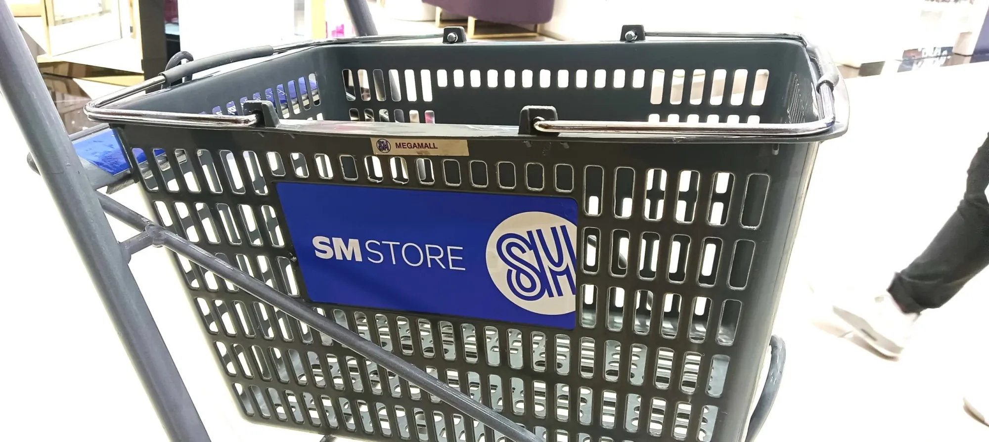
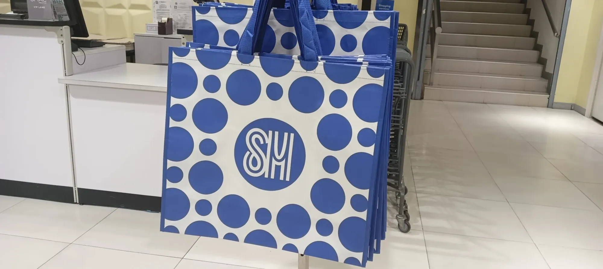
The new logo can stand on its own. However, in most materials, it is tilted at around 28 degrees left or right, and partly cropped. Sometimes it’s accompanied by lots of circles, creating a polka dot pattern. This application gives an impression that whenever there’s the SM brand stamped in each material, it must be of quality.
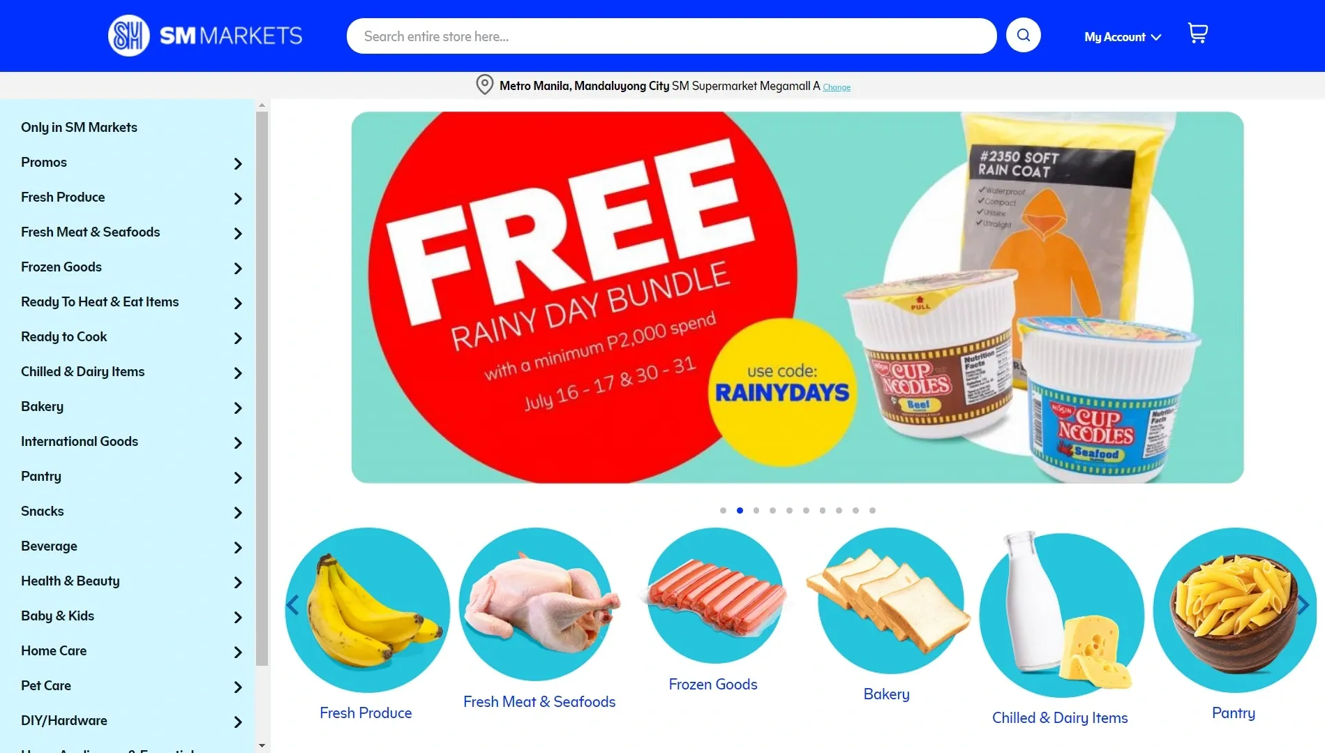
The websites of SM Supermalls, ShopSM and SM Markets now also reflect the new branding. Its other online assets SM Deals and SM Malls Online now also reflect the new logo.
We also went on the field to capture actual applications of the new SM brand at Megamall and Mall of Asia:

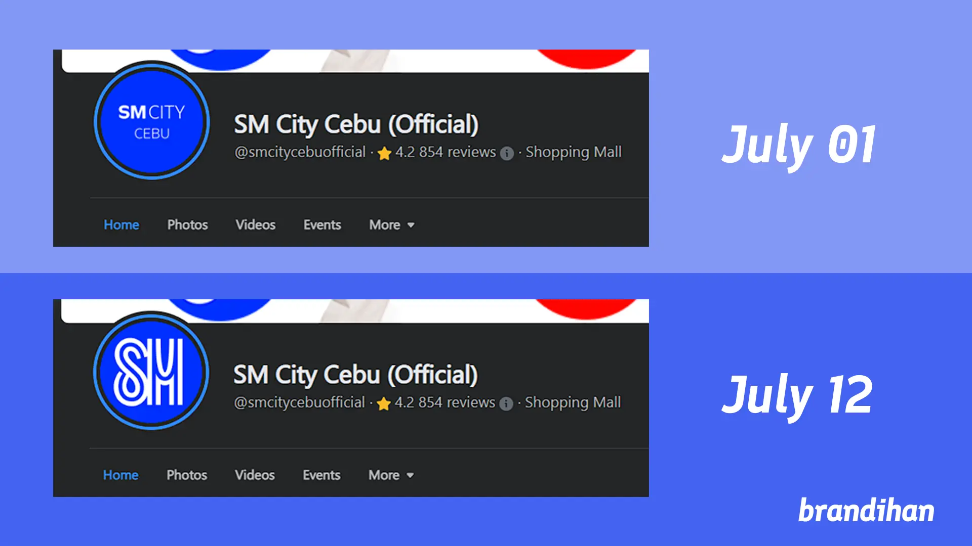
The brand rollout did face some birthing pains: SM Supermalls’ social media pages had to sort out how they will display profile pictures. One specific example is on the SM City Cebu page:
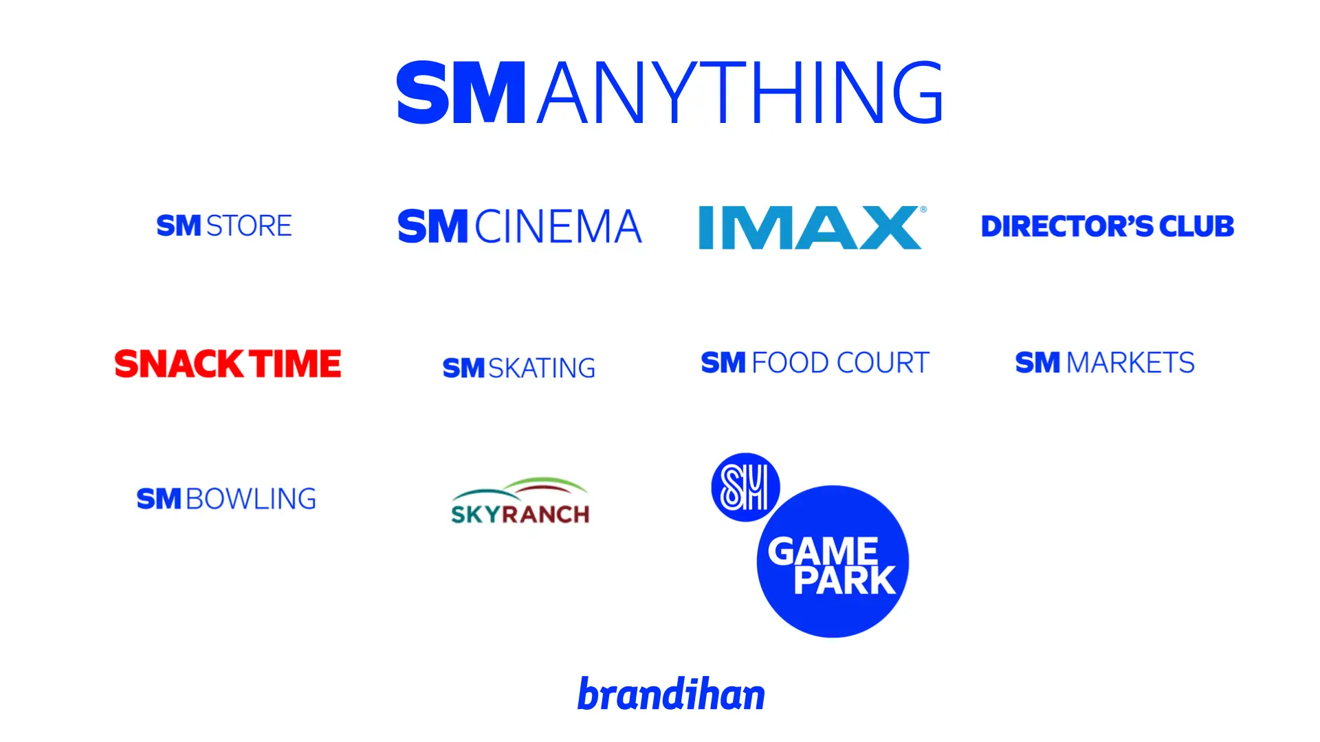
The rebranding that SM is undertaking is in line with other companies aiming to streamline and unify branding so that it encompasses its gargantuan number of services and subsidiaries.
SM’s new branding tries to get every part of the SM corporate umbrella on the same page and under the same communication. Not to mention that the new font and color allows for most SM entities to look like they come from the same company and brand.