Robinsons Malls Brand Gets a Facelift
A new look graces Robinsons Malls, with a new song to top it all off.
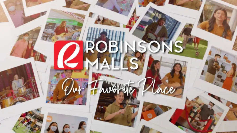
Robinsons Malls brand gets a facelift just before the month of July ends. On top of that, they got the folk-pop band Ben&Ben to sing their theme song, “Our Favorite Place.”
On this post, I am sharing my take on this new logo design, as well as look back at how the Robinsons brand evolved.
Robinsons Malls x Ben&Ben
The music video is shot at Robinsons Magnolia, and I appreciate the beauty of the music video—it blends well with the tone of the song. It’s been a long time since a brand song gave me LSS—the last one was UDD’s New World for Globe (2014).
What I Miss From the Old Brand
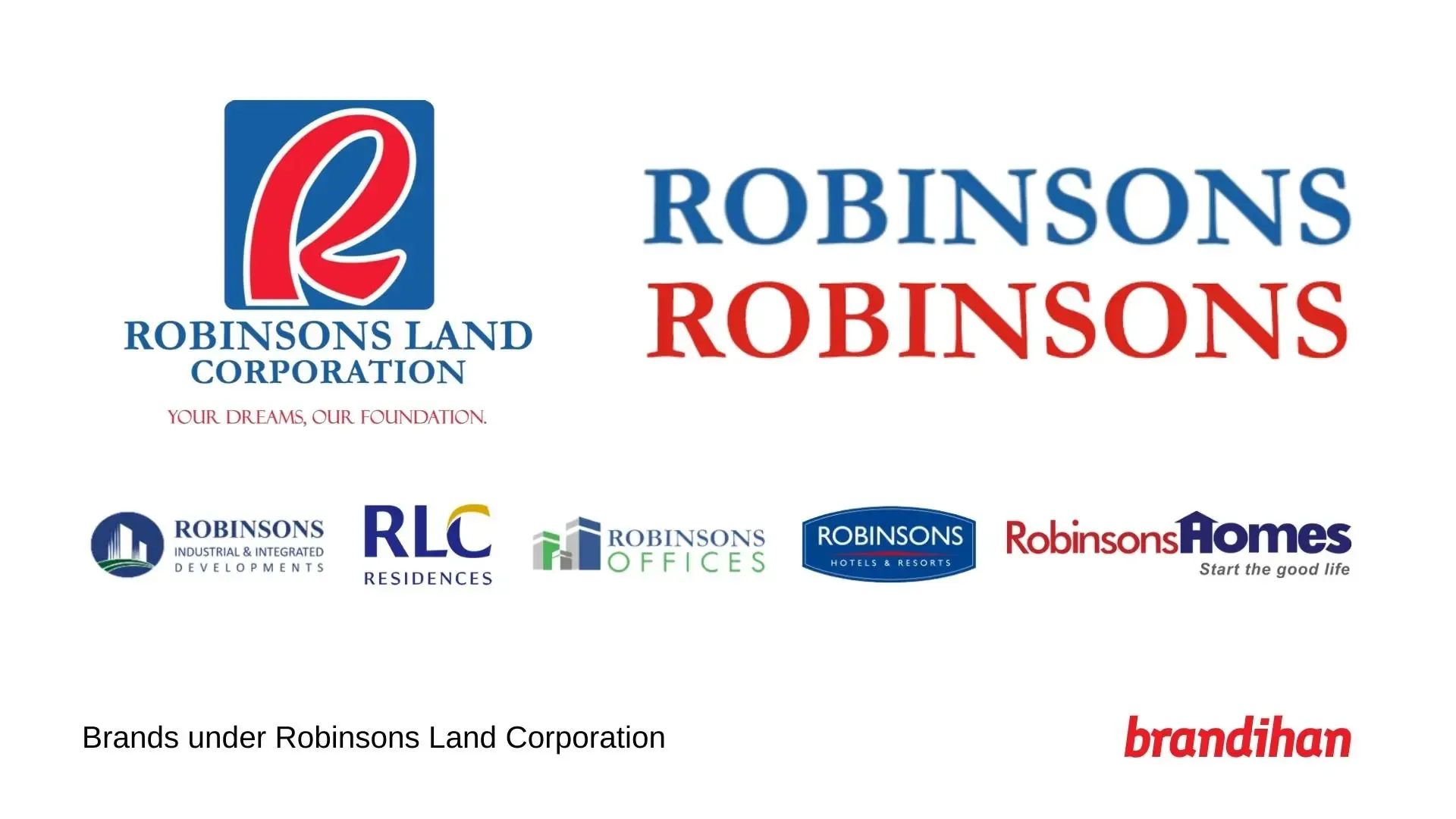
I’ve been familiar with Robinsons brand for a long time—the serif font that’s also applied in the logo of parent company Robinsons Land Corporation, as well as the iconic R logo that never gets old, just as unique as SM.
If there’s one thing I need to point out, Robinsons suffer the same brand problem as SM does before the latter decided to have a unified branding system.
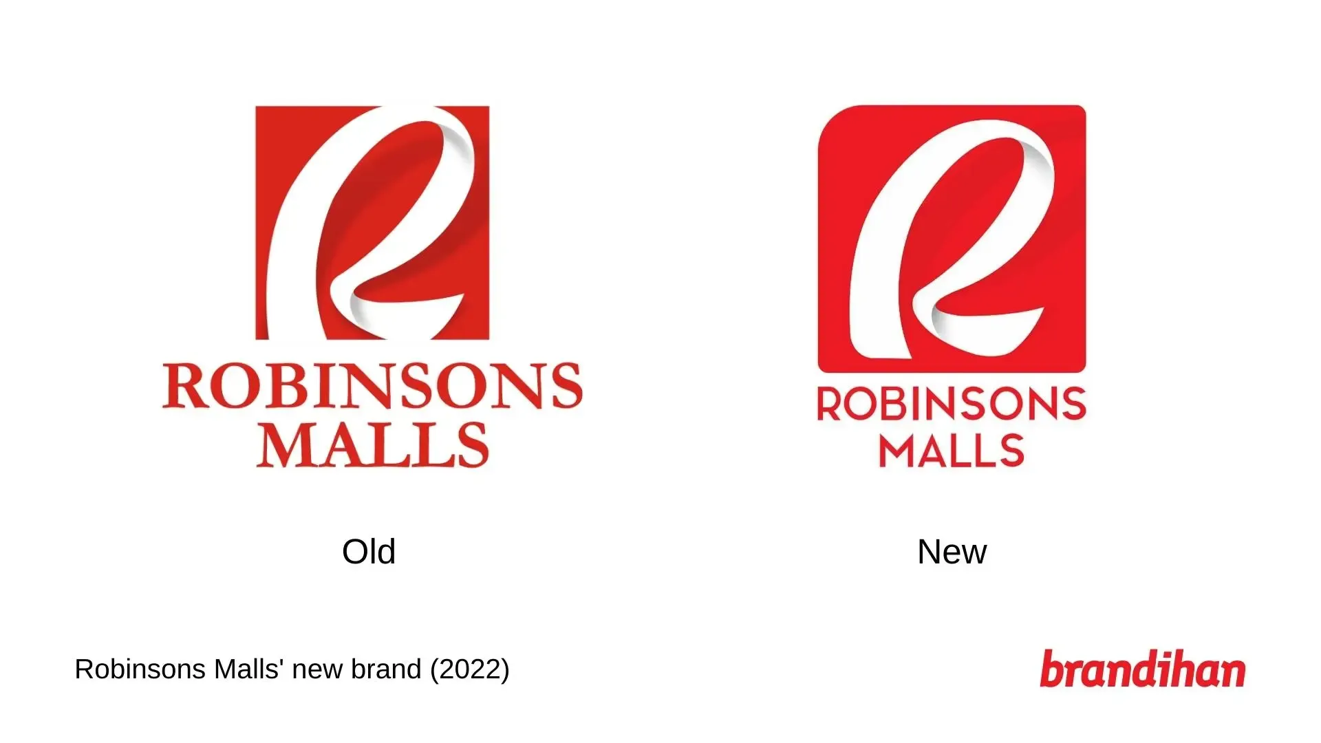
If there’s something I miss from the old brand, that’d be the use of the serif font. The new Robinsons Malls logo sports a sans-serif typeface different from what’s being used at Robinsons Bank.
The Iconic R Logo
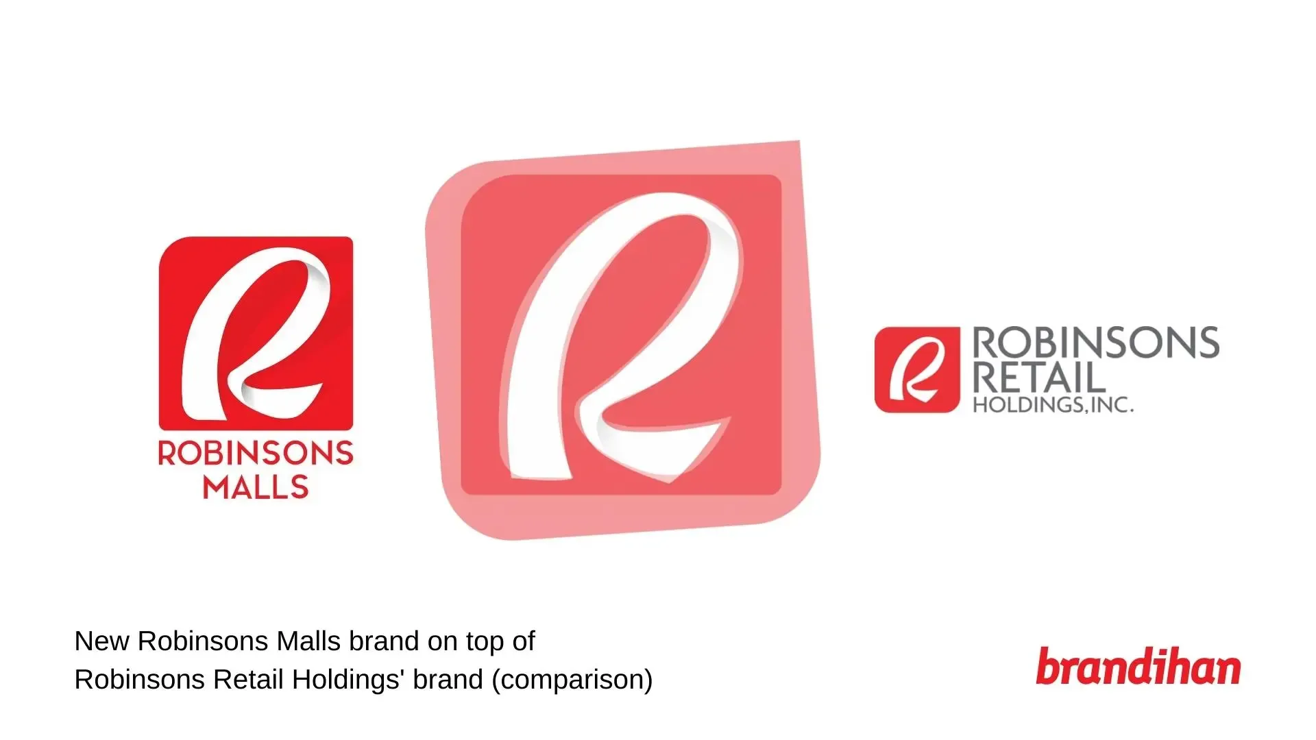
As I was preparing this piece, I wondered how the iconic R logo used in the new brand fared well with the logo used by Robinsons Retail Holdings. So, curious me placed both logos together. I thought that the R logo looked the same as others, but not in this case.
The new Robinsons Malls logo cut some corners to make it a bit curvy. It still retained the shadows around the corners from the previous logo, keeping its “ribbon” appearance.
Logo Application
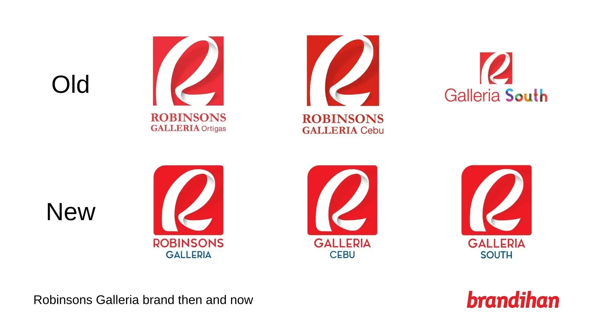
Robinsons Malls’ Facebook pages have changed their logos already, so I decided to look at its malls in Manila and Cebu. Flagship mall Robinsons Galleria (Ortigas) keeps its name; Robinsons Galleria Cebu is now prominently called Galleria Cebu, and so does Galleria South.
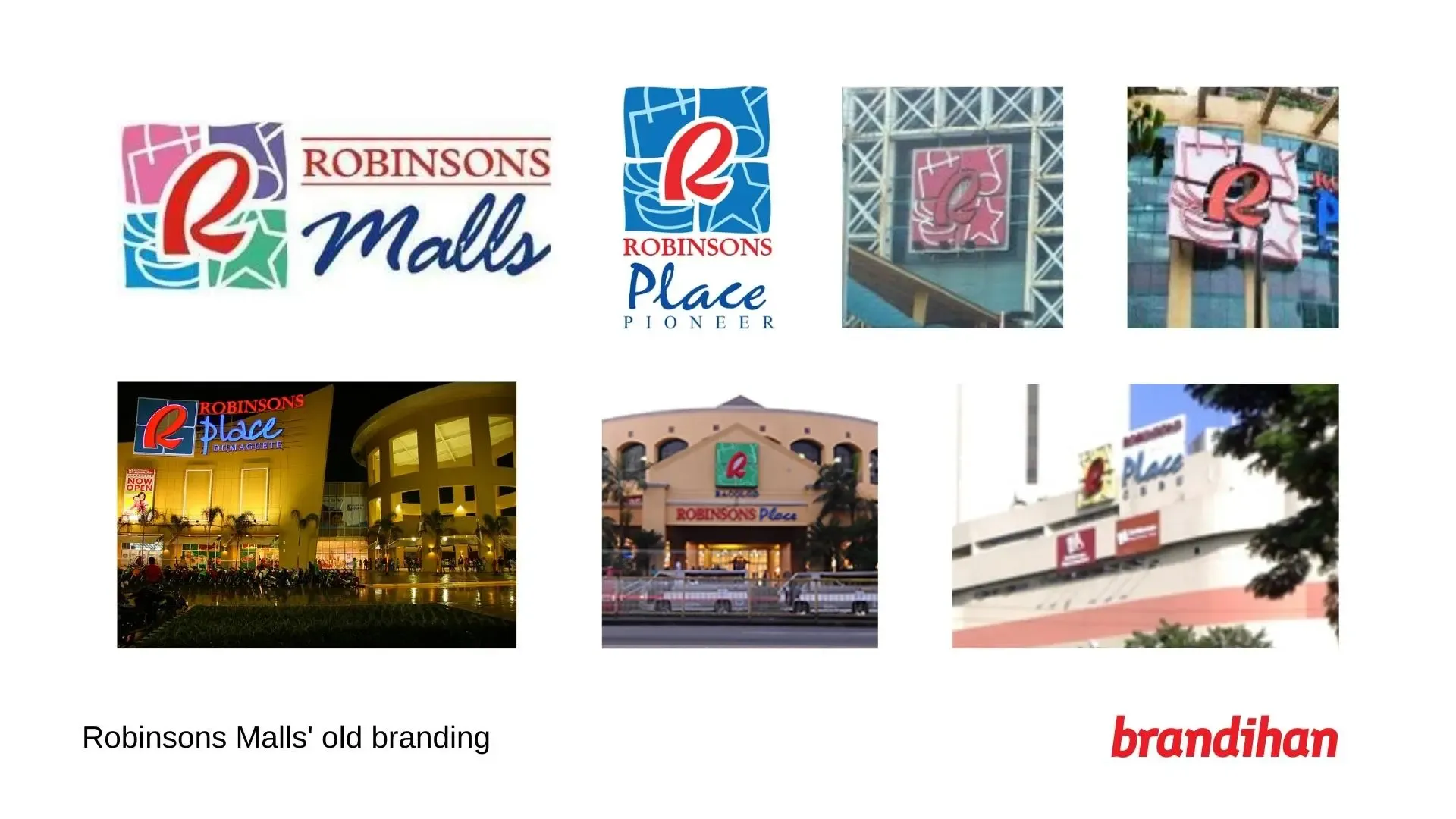
I look back at a time when the logos of all Robinsons Malls were colorful. Galleria Ortigas gets multiple colors, Bacolod was light green, Manila’s was light-ish pink, Cainta got a darker shade of pink, Cebu is dressed in yellow, Pioneer and Metro East in blue, and also that odd one in Dumaguete. Those were the days.
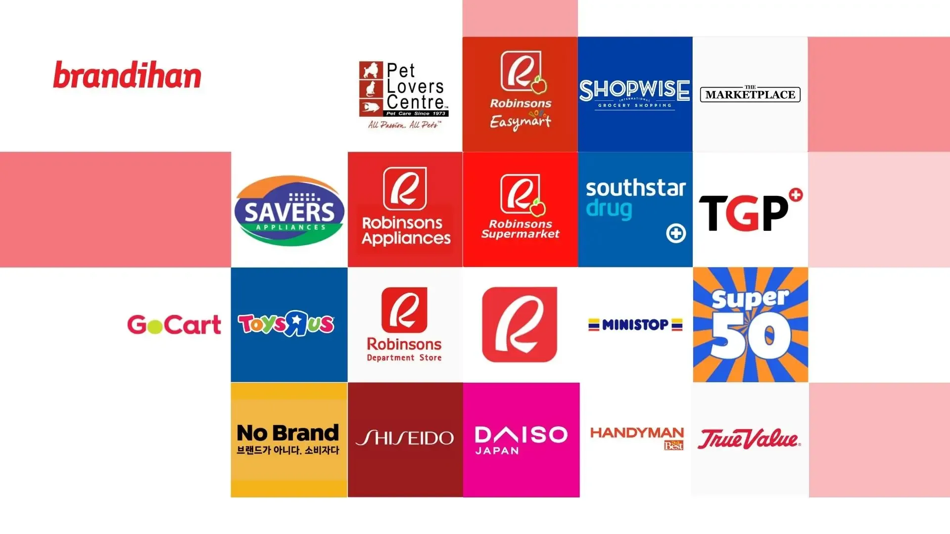
Overall, the new brand felt aligned with Robinsons Retail Holdings’ anchors such as Robinsons Department Store, Supermarket, and even Robinsons Appliances.
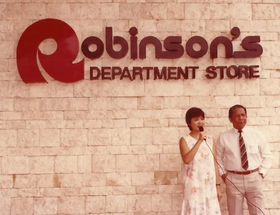
A piece of trivia: Did you know that the R logo used to be thick when it was shown first to the public – and it was spelled with an apostrophe?
I do look forward to a future where Robinsons can find its own branding style, because at this point, it felt to me like things are all over the place. Only the anchor brands sport the same logo format as the holding company, and the rest is a mix of new store concepts (Super 50, Handyman), stores from overseas (Toys R Us, Daiso, Shiseido, No Brand), or acquired assets from other companies (True Value’s franchise in the Philippines, Rustan’s Supercenters—Shopwise and The Marketplace, South Star Drug and TGP The Generics Pharmacy, Savers Appliances).
Nevertheless, I’m looking forward to the new mall they’re rebuilding at the site of the old Forum Robinsons. I hope I can call that my favorite place too.
The #RobinsonsMalls logo has been redesigned with a brighter red and a new typeface, which is applied to all Robinsons malls.
— Brandihan ✨🇵🇭 PH logos and branding! (@brandihanPH) August 25, 2022
READ MORE 👉 https://t.co/c39x72GOWC pic.twitter.com/wUUZzJR7uJ