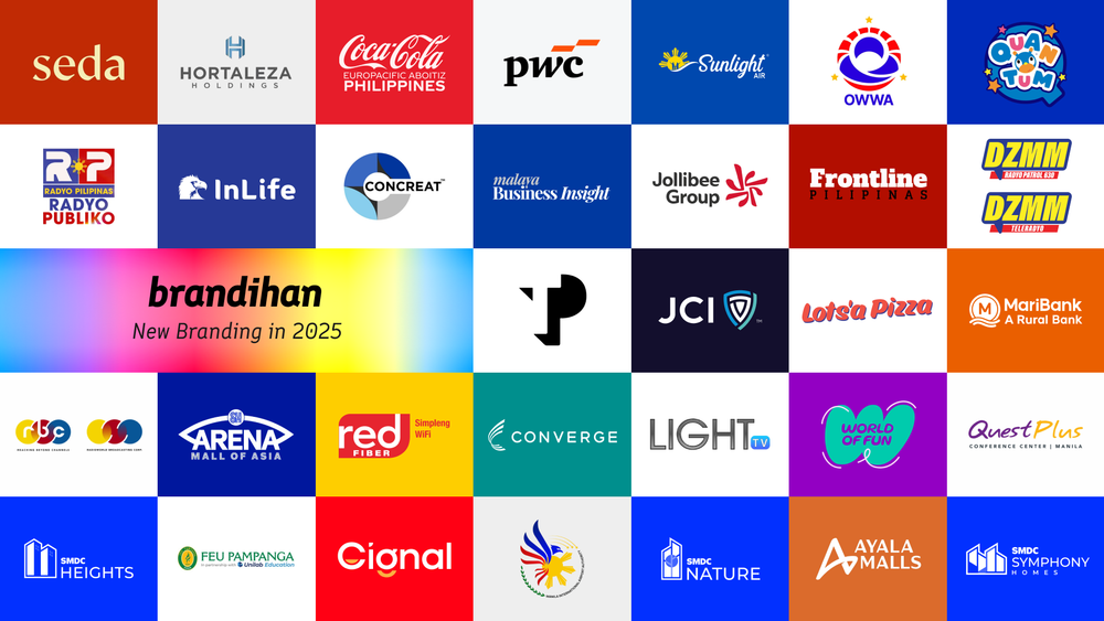
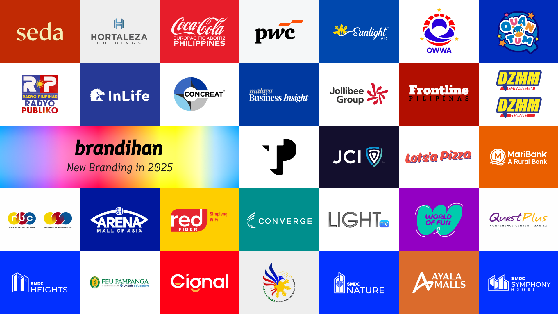
Recap: New Branding in 2025
We've kept track of the brands who had new facelifts in 2025. Here's what we found (so far).
We at Brandihan are happy to share our list of New Branding in 2025, giving a recap of what has changed that year (Yes, it's already close to May 2026, we know).
On this post, I'll subjectively share my takes on these brands, plus the common themes we've spotted among these new logos. We're also listing some international brands for good measure, simply because they're so ingrained in our memories.
(If we missed out on a new logo from that year, tag us on Twitter or Instagram!)
2025 Rebrands by the Figures
- Most of the changes we logged from 2025 are in the field of Media, whether if that's a TV or radio station, a program, or a media business. That's followed by brands under Food, Leisure and Recreation, and Tourism.
- Government, Utilities and Holdings segments had 2 new logos each, while there's a single logged brand refresh in other segments (Accounting, Insurance, Real Estate, Education).
- What's now known as the University of the Philippines College of Media and Communication only had their name changed last year, coinciding its 60th anniversary. Even if you don't see the CMC in this list, we recognize their milestone year as a honorable mention.
- If we are to pick the top colors brands used to refresh their identities that year, Blue and Red pops out the most. A subjective look at the logos gives that overall impression.
- SM had the most rebrands that year – on top of changing MoA Arena's official name, its property arm SMDC launched three new labels: SMDC Heights, SMDC Nature and SMDC Symphony Homes.
Biggest Rebrands of 2025
Whenever we think of the biggest rebrands of the past year, we think first of how huge the impact it does towards the brand as well as how we as people see it. We then look at the story behind the brand change, and figure out by feeling which of these changes were given ample consideration.
Of course, not every take we put in here is aligned with what most people see, so you're free to share what's on your mind (with civility).
- Jollibee Foods Corporation (doing business as the Jollibee Group) launched the JoyMark last May to give the homegrown conglomerate its own identity aside from the beloved bee mascot we know and loved.
- With the help of brand consulting firm Landor, the unifying JoyMark was created with an 8-degree tilt which you won't see until you use a protractor.
- Lots'a Pizza's new branding identity system was produced ahead of their 40th anniversary this year. We saw their full dine-in experience at Pearl Plaza in Ortigas Center, and it looked just fine.
- While Ayala Malls' new branding rolled out in full this year, it was first introduced last year.
- The change was done in line with its goal to build more malls across the country, as well as renovate its flagship malls.
- Quantum Amusement also made a major brand change, putting more fum and whimsy into their main brand. We have yet to visit the SM Sta. Mesa branch to see the full experience.
- Same with Quantum, World of Fun also added more whimsy into their brand, tapping Plus63 for their rehaul. Their SM Baguio branch should reflect the full rehaul of their visual experience.
- The Philippine branch of multinational cement brand Cemex becomes Concreat Holdings Philippines following the Consunji group's acquisition in late 2024, acquiring 90% stake of the Mexican building materials company and is now led by an all-Filipino team.
- Colegio de San Sebastian-Pampanga was acquired by Higher Academia Inc., a joint venture between the Far Eastern University and United Laboratories. It is now known as FEU Pampanga in partnership with Unilab Education.
- Government agencies like the Overseas Workers Welfare Administration and the Manila International Airport Authority have one thing in common: Their reliance on the national flag colors. Much words have been said, describing the new branding of these two agencies.
- At best, OWWA's new logo was well-thought. If you ask us, the earlier prototype felt much easier to the eyes than what was approved by the client.
- The government agency made it clear that no public funds were spent in the production of this new identity, and the designers add that it was a heartfelt donation.
- Just how long-lasting was the impact of the call letters DZMM? When operations of the 630 kHz went to a joint venture between ABS-CBN and Philippine Collective Media Corporation, they relaunched as Radyo 630 (say, sais-trenta), detached from its legacy brand.
- When they went back on air as DZMM around May that year, it was welcomed with a familiar stingers and the Peter Rabbit (Musñgi) voice-overs, sans the ABS-CBN News label.
- Nielsen Philippines' ratings months after the revert proved their decision to revert was right, as the station moved to the #2 spot from #5. Now that's what we call 'balitang kumpirmado, sigurado' (news that's surely confirmed).
- In the same manner as DZMM, we sure missed the sound of News5's Aksyon brand composed by Jimmy Antiporda, now used by Frontline Pilipinas when it rehauled its identity May last year.
- We then connect to Cignal TV, which like News5 and TV5 Network is under the MediaQuest umbrella.
- I personally often read the new logo as 'Cional' from a distance, as there's little contrast between the bright yellow and red colors.
- International organization Junior Chamber International followed other civic organizations like Rotary International in reinventing their brand, launched during the 2025 World Congress in Tunisia.
Subtlest Logo Facelifts of 2025
We can name handfuls of logo changes done in 2025 – the kind of change you won't see from afar (as if it's business as usual), but can be noticed upon closer inspection.
- Insurance company InLife (Insular Life) made yet another facelift, going back to a simple blue color. They even got a new jingle and sonic branding to line up with their tagline "A Lifetime for Good."
- Malaya Business Insight revealed a new look during their 42nd anniversary. The business paper now fits a cleaner style, something we honestly felt is a necessary action to keep up with their competition.
- We understand Sunlight Air's refined identity was, according to them, a result of looking at their research and customer insights, positioning the boutique airline as the one which will carry its passengers to their 'Next Story'.
- Converge's new branding sports a font style which makes use of some rounded corners and a new C icon that carries its new mission and core values, transforming from just a telco into a tech company.
- Zoe Broadcasting Network's Light TV has dropped its tagline "God's Channel of Blessings" and kept things simple... unlike Radyo Pilipinas (and its Radyo Publiko tagline).
- MariBank Philippines? More like SeaBank but with an 'M'. The name change was approved by the government following the bank's acquisition by its Singaporean counterpart (Indonesia still has the SeaBank name though).
- Professional services network PwC swapped blocks with just two parallelograms, in line with their debut as the Official Formula 1 consulting partner. (Of course, the Philippine branch also receives the slight brand change.)
- Such change was described as 'utterly pointless' by critics, but hey, what do we know? Maybe most of them are F1 fans, hence the slants which represent motion.
- Business process outsourcing company Teleperformance formally became TP, because they're no longer just defined by their performance in teleservices (in fact, they've added more meanings to the acronym itself).
- Back to Manila, SM Arena (yes, that's the new name for the mall giant's large concert venues) has applied the company-wide Henry Sans font through its visuals, seen last November when the team watched the Miku Expo concert.
- ...and yes, the new name for the MoA Arena is SM Arena Mall of Asia. This goes hand-in-hand with the launch of SM Arena Seaside Cebu at the South Road Properties soon.