Chinabank Unveils New Logo, Brand Identity
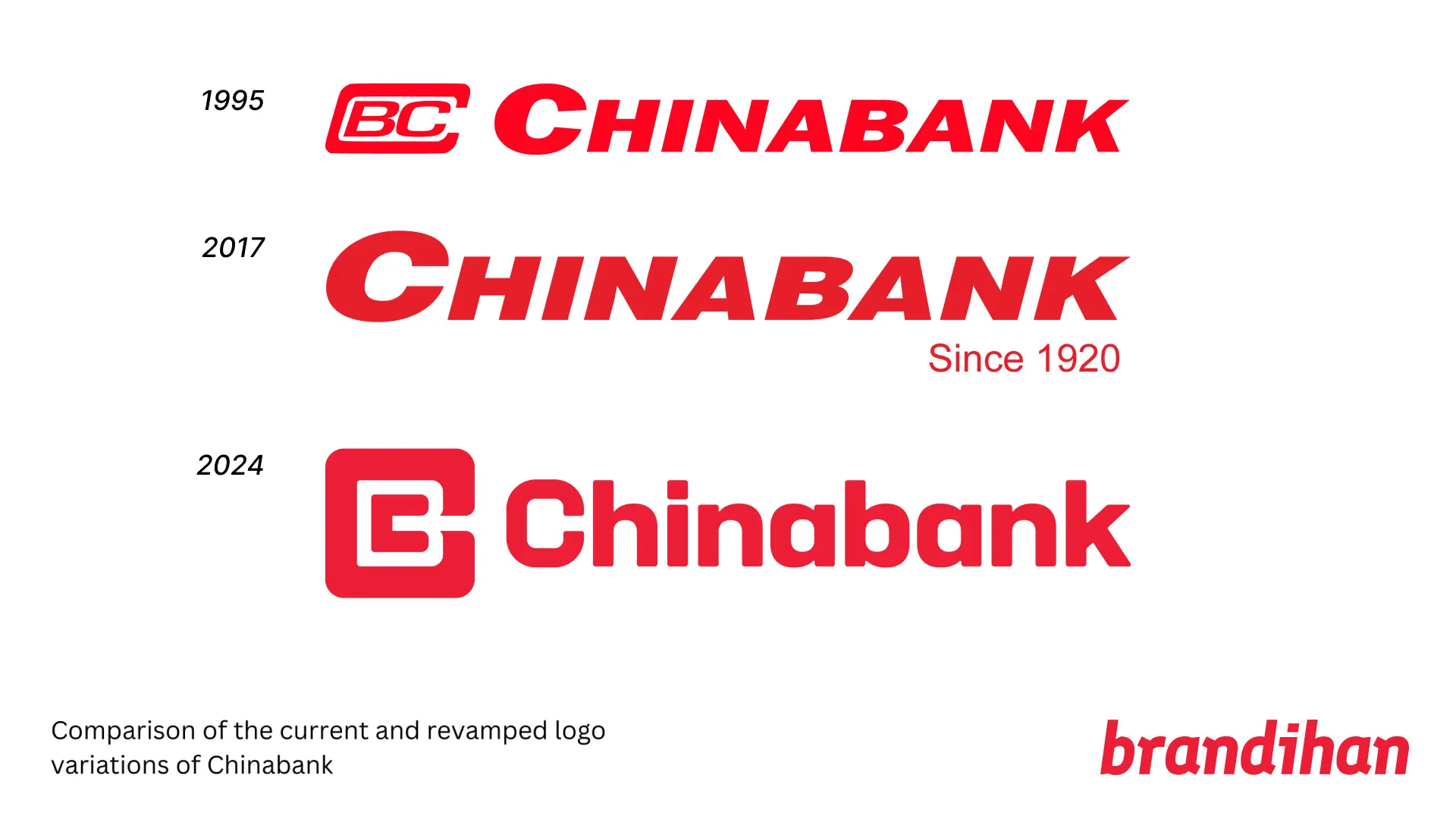
This is Chinabank's latest brand refresh since its iconic logo was introduced across its collaterals between the 1980s and 1990s.
After more than 100 years since the bank's establishment in August 1920, Chinabank has unveiled a new logo as well as a new brand identity, focusing on the brand message of "Focused On You."
It's the bank's latest brand refresh since its iconic logo was introduced across its collaterals between the 1980s and 1990s.

As part of the new brand identity rollout, Chinabank has also tapped Miss Universe Philippines 2023 Michelle Dee as its brand ambassador, which according to the bank, embodies their vision of always having determination and focus.
Chinabank's New Brand Film and Connection to 100-Year Old History
The new brand film from Chinabank, with 60-seconds run time, focuses on the bank's message of always being with their clients whenever they need assistance to build businesses, as well as achieving life goals like of travel, real estate and car loans.
It is worth noting that Chinabank survived during World War II, thanks to its steady deposits and transfer of assets to the United States High Commissioner to the Philippines Francis Bowes Sayre Sr. for safekeeping until its reopening in 1945.
Moreover, it was also able to keep afloat despite the political turmoil in the country in the 1980s as well as during the Asian financial crisis in 1997.
One of the defining branding factors in the brand film is the "C" icon, which has been one of the bank's most notable symbol in its branding, and also appears in other iterations of the bank's recent logo that included the "CBC" iconography.
It is worth noting as well that around 2017, the previous logo of Chinabank dropped the "CBC" iconography in its logo, making this rebrand the return of said iconography in its logo.


Screencaps from Chinabank's new brand identity film, showcasing the iconic "C" logo.
A More Refreshed Look for a Bank With Inconsistent Branding?
It is worth noting that while Chinabank has unveiled this new branding, the online rollout has only been seen across their social media pages and their website, which have been updated, except for its mobile app which still utilizes the old branding. Despite that, several of its branches in Metro Manila, including its main one in Makati have updated their branding.
Moreover, one could also note that this could be a step for the bank to have a more unified branding approach in competition to much larger private banks nowadays in the country.


Additional shots of Chinabank branches in Quezon City
For context, Chinabank never really had a proper logo identification since its founding in 1920 when it was formally called as China Banking Corporation.
In some of its brand collaterals between its reopening in 1945 and in the 1980s, the bank used multiple branding variations of its company name, with the "CBC" branding becoming also more prominent.

Overall, Chinabank's overall rebrand is a fitting tribute to the bank's continued resilience in the Philippine banking scene. And while the bank could certainly work on continuously rolling it its revamp across all of its collaterals, Chinabank's brand revamp certainly is an ode to how Chinabank can stay relevant despite a 100-year old brand.
We also suggest to read Chinabank's Centennial Story, where they go into full detail the origins of the bank and how they were able to circumnavigate multiple economic woes over the year.
In an earlier version of this story, we mistakenly identified the dropping of the CBC icon at 2020 (in line with the 100th anniversary). After reviewing other collaterals such as annual reports, we can confirm that the earliest use of the previous logo was in 2017.
New photos of branches have also been added, taken by the Brandihan team.
The Chinabank icon makes a return, as this week a completely new brand identity for the bank has been rolling out both online and onsite. It's the latest refresh since its iconic logo was introduced between the 80's and 90's.
— Brandihan ✨🇵🇭 PH logos and branding! (@brandihanPH) April 20, 2024
Read more on Brandihan:https://t.co/NHO5SGzHEK pic.twitter.com/IBUPidGVhE
RELEVANT POST


